Projects / KD Funds

KD Funds

Asset management company
www.kd-skladi.si/en/

KD Funds is the first Slovenian management company, known for its tradition, excellent management and the trust of its investors and professionals since 1992.

With joint forces we designed a very informative, professional and technologically advanced website that takes its visitors into the world of investment and helps them find the best option for their funds.

Website:

  • Planning
  • Design
  • Programming

Websi, 3rd place – Financial sector

The website KD Funds received a bronze medal at Websi 2018 in the category Financial sector.

Before/ After

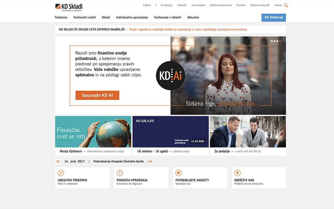
Before the renovation on the left / After the renovation on the right

Clear navigation

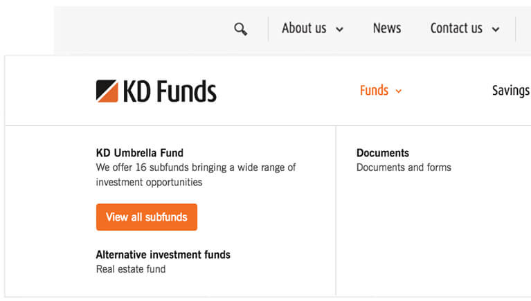
The users can quickly find the desired information or the most suitable product. The main navigation bar was simplified and it now contains links that are directly connected with the products of KD Funds.

With the presentation of the main two options of savings – funds and savings plans – the drop-down menu takes into account that the site is visited by users in two different stages of exploration.

The navigation therefore not only offers access to detailed presentations of savings options but also additional content, such as a detailed description of operating with KD Funds, frequent questions and answers and different interactive tools.

0%
increase in appointments with a financial adviser
0%
increase in the number of pages per session
0%
increase in the number of submitted contact forms

A simple calculation of savings options

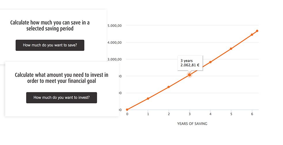
The calculator offers two different calculations – how much you can save with the existing funds and how to get to the desired amount.

The calculator’s specialty is the first step, in which we help the user correctly insert the required data for the desired calculation.

Comparison of funds

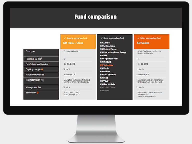
The comparator of funds, which allows the comparison of three funds simultaneously, offers great help in getting to know the KD Funds and in deciding on the optimal investment. This tool compares key data of each individual fund, while for a more detailed overview the visitor is offered a comparison of the performance chart of each sub-fund.

A strategic placement of calls to action

Since the site’s topic is complex and it’s easier to make the right decision after a personal consultation, we’ve placed calls to action throughout the site, inviting the user to a consultation with a financial advisor.

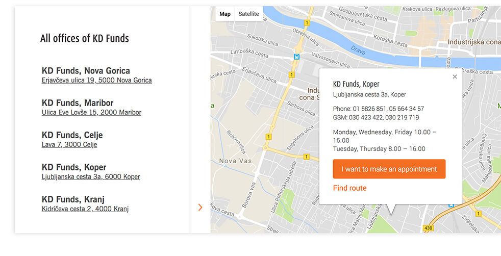
A simple contact form enables the user to choose the closest office and the most suitable time slot for a consultation.

Application form

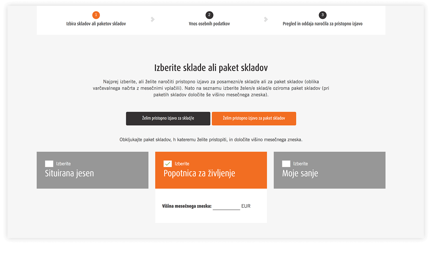
The visitors who received enough information to make a decision can fill out an application form and join individual funds or packages of funds in three simple steps.

Results

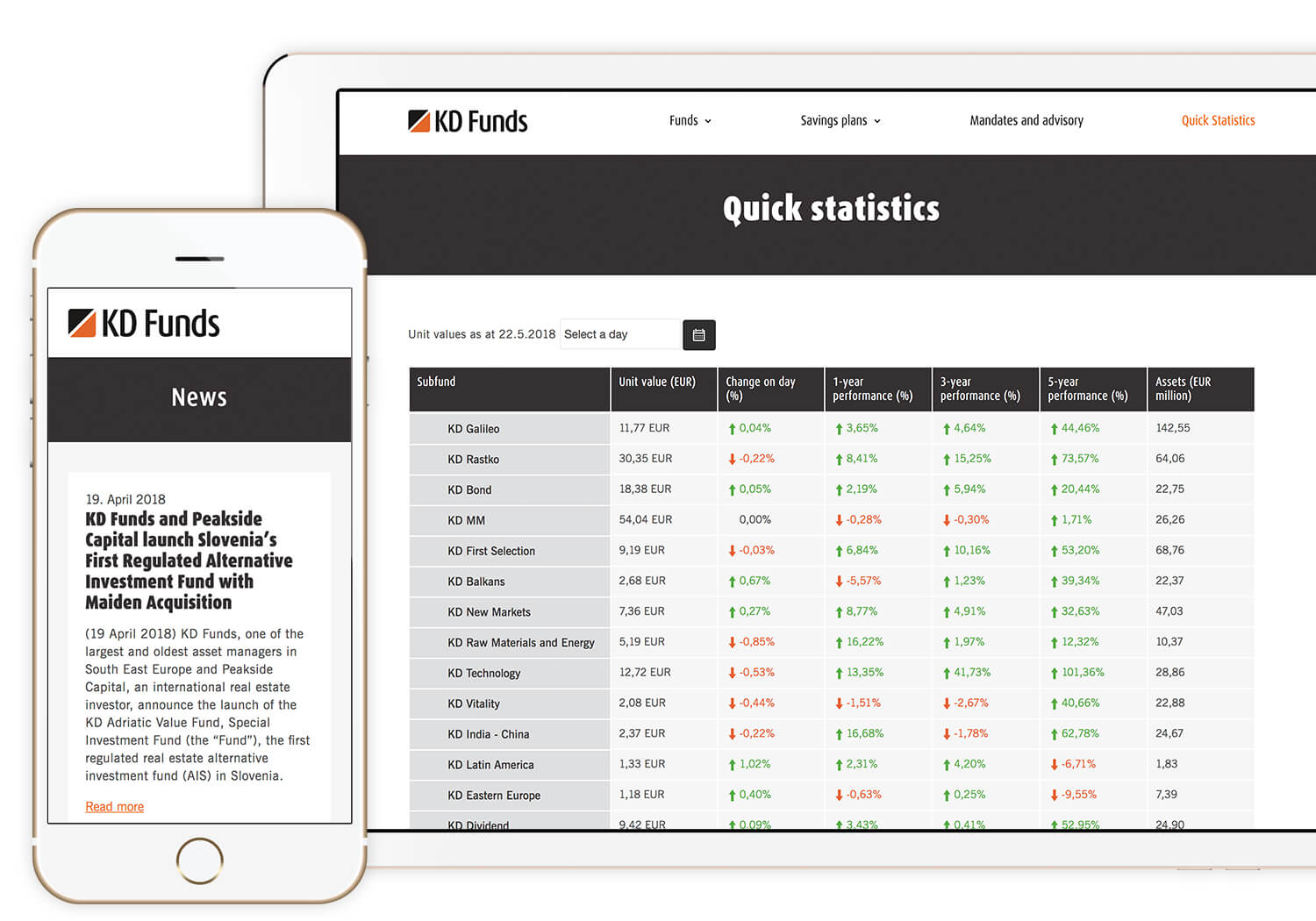
A special challenge of this project lay in the integration of an enormous number of data that is updated on a daily basis and in how to present them in a clear and straightforward way. With excellent responsiveness and cooperation with KD Funds we’ve successfully executed the integration and the result of the redesign is a more minimalistic and a user-friendlier website.

An important part of the redesign was also the adjustment of content for different devices, which was successfully implemented. The number of mobile sessions grew for 159% after the redesign and the average session duration grew for 112%.

0%
increase in appointments with a financial adviser
0%
increase in the number of pages per session
0%
increase in the number of submitted contact forms

Time for a new website?

Is your website still not user friendly?
Is it slow, while its design doesn’t properly reflect your business image?
Then it is high time for a new website!

Let’s start a project