Style guide benefits
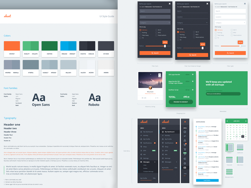
It’s easier for designers to design a website if they follow the rules that can be found in the style guide. This enables greater transparency and organization of elements, which are being used by the designer, and it also helps the developers to a clearer CSS code.
When the website is finished, we usually have to deal with various corrections or additional subpages and since you may not be the only one who is designing the page, it’s easy for other designers to pick up where you left off with the help of the style guide. The guide offers us greater transparency over the look and feel of the website elements, so it is indispensable in potential cooperations. It is advisable or almost necessary in bigger companies, where we have several designers working together, since it helps us keep a more consistent website.
Style presentation
Before we can decide on the elements of the website, we need to analyse the operations of the company, the existing and potential clients, the company’s vision, mission and the services it offers. It is especially important to analyse the clients or (potential) buyers who will visit the website. If we want it to serve its purpose, we need to design a website that will offer a great user experience. When designing the first outline, the goal is to pick a middle ground that will take into account the client’s wishes and the user experience. For a good final result or, in other words, for a conversion (purchase, signing up for e-news, inquiry, registration, etc.) it is extremely important to predict the behavior, habits and wishes of potential buyers and to analyze the customer journey with the help of analytics.
1. Colors
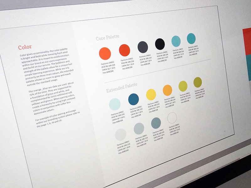
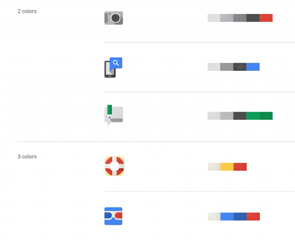
First, we need to choose the primary and secondary colors. The primary colors are the main colors that are specific for the company, while the secondary colors represent the additional colors used for highlights.
When you’re deciding on the color of the main titles, it’s recommended you choose a darker color and use a brighter or the same hue for body text. Keep in mind that black isn’t the best choice for the color of the text because it’s not a warm colour and is less readable, so choose lighter tones of black. When you have the primary and secondary colors, you basically have your color pallet with different shades for elements exposure.
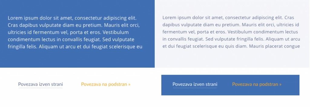
Now that we have selected the colors, it’s important to compare them with different background hues in order to ensure easy readability. We have to keep this in mind if we want to choose the right background hues for the text.
When choosing the appropriate color for buttons, wallpaper, etc., it is good to consider what effect colors have on humans (i.e. the psychology of colors), which is especially important from the point of view of the users on the website because, after all, people are visual beings. Using the correct colors, we can get closer to the target audience and the potential customers and ensure a better user experience.


