They say people are creatures of habit. However, it surely can’t hurt to shake things up a bit every now and then, right?
I’ve been sitting on the idea of redesigning our logo for quite a while. Every time I saw it, it just didn’t evoke those feelings I got when I returned to Škofja Loka in June 2018. In those 6 months of my absence the work progress in the company changed substantially. Everything is done on a completely new level, my coworkers became even greater experts in their fields and this sweet, chunky logo just didn’t do them justice anymore.
I wanted people to get a sense of our expertise at first sight and I believed the old logo was sending out the wrong impression.
A scary start
By talking with my coworkers, I realized I’m surrounded by quite a few like-minded people. The greatest supporter of the redesign idea was Darko, our design team lead. As “partners-in-crime” we decided to test our ideas and wishes behind our boss’s back.
Because we didn’t want to approach Miha empty-handed, we made a few drafts before presenting him with our idea. Darko and I understood that it will be hard seeing your child growing up and changing, but, to our surprise, Miha was more than happy to support our project.
Of course, we explained how and why we got this idea …
- As written above, the current logo looks a bit too childish, while we’re aiming for a more professional first impression.
- This year marks Optiweb’s 10th anniversary, which is the perfect milestone to present our redesigned logo.
- Moving into new offices is already a big change – a new logo simply adds a cherry on top.
The above-mentioned valid reasons convinced all team leads at their weekly meeting and we got the last green light to redesign Optiweb’s logo.
Because we’re a tightly-knit group of coworkers, I didn’t set about changing the new logo on my own.
I first held a brainstorming session with a few of my coworkers, where I wanted to question everything we knew and had so far: the blue color, capital letters, bolded letters, rounded letters, sans-serif font, the sign W, etc.
We soon realized that we didn’t feel comfortable straying away too far from the old logo.
By keeping in mind our debate and our primary ideas (as to why redesign the logo in the first place), I got to work.
Since you simply can’t know what will work and what not until you try it out, I tested the numerous versions we’ve discussed and I used many an hour trying to find the right font and test the right modifications, the correct deviations, shades and curves. But I won’t bore you will all the iterations that came out of this process …
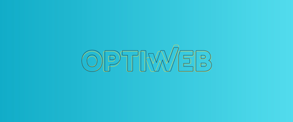
We’ve got ourselves a new logo!
Changing the angles
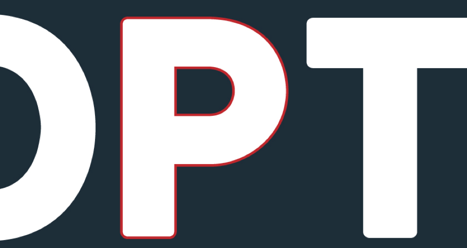
One of the things that was visually the most distressing, were the extremely round angles of the letters. This was also one of the reasons why the logo looked a bit childish. The angles are now quite smaller.
The roundness of letters
The extremely rounded letters also give out the impression of excessive simplicity and they simply don’t do justice to our serious field of expertise.
Therefore, the bellies are now smaller, while our O is “perfectly imperfect”. ;)
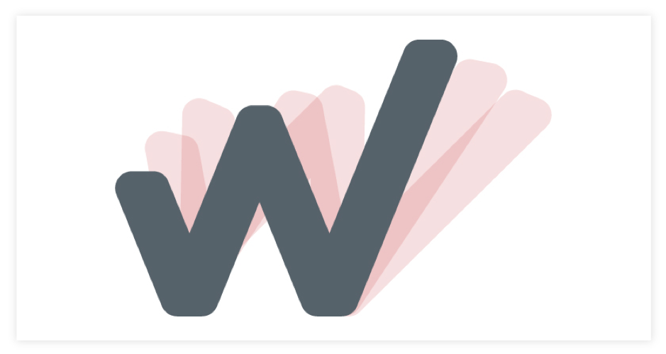
The inflexible W
One of the reasons for the redesign was also our W. Visually very disturbing but highly recognizable. If the W were to stand for itself, it would be very unstable – as if it’s about to tip over at any moment.
Because of its form, it didn’t really fit into the name …
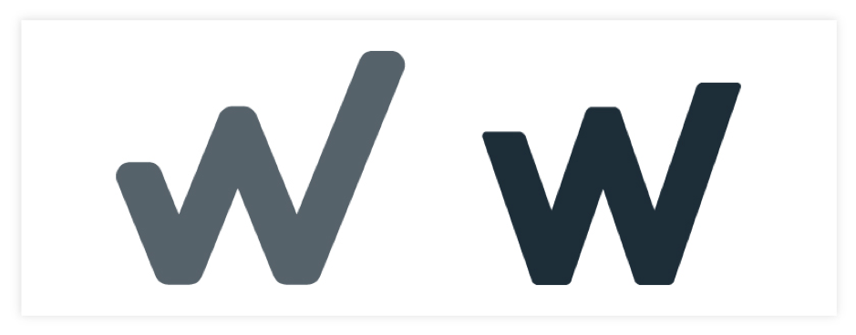
The angles of the diagonal lines were too big so, consequently, the W was surrounded by white space that was incompatible with the rest of the word. The problem could also be found in the difference in height of the right and left part of the W. The right side was quite noticeably sticking out, ruining the balance between the word and the sign.
The angles of the diagonal lines are now smaller and the distance from the top of left and right line to the middle part is now smaller by half.
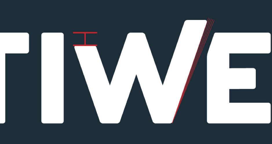
The detail
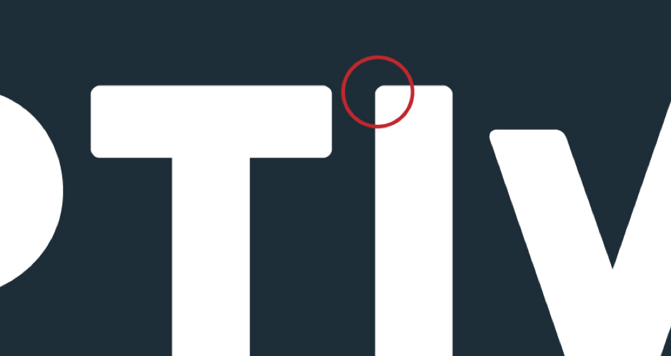
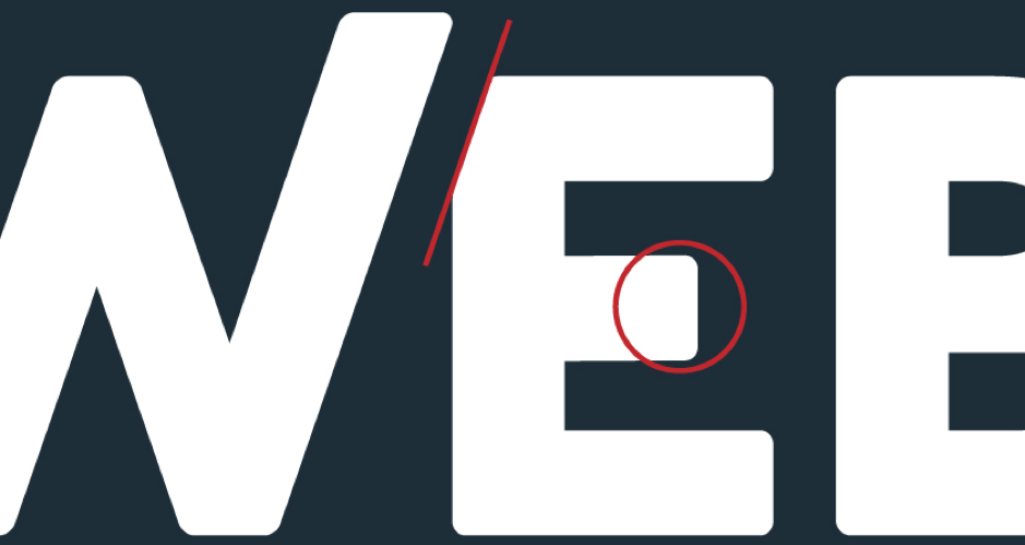
In order to make the space around the W as even as possible, we brought E closer to the W. In order to keep the negative spaces in the word, we’ve decided to chop off the upper left corner. As I like to say, “The devil is in the details”, and this detail is my favorite part of the logo.
Let it breathe
If you take a look at the old logo, you can see that the first part of the word has more negative space in comparison with the last part of the word. In order to even this out, the middle part of the E is slightly shorter than the E in the primary typography. This also added more space between the letters E and B.
Colors
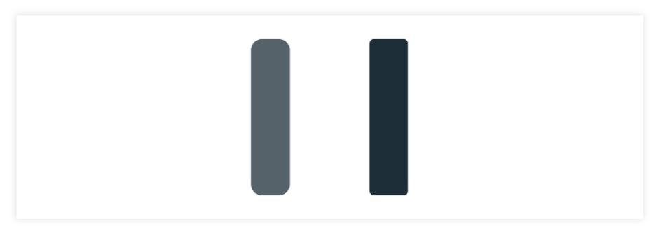
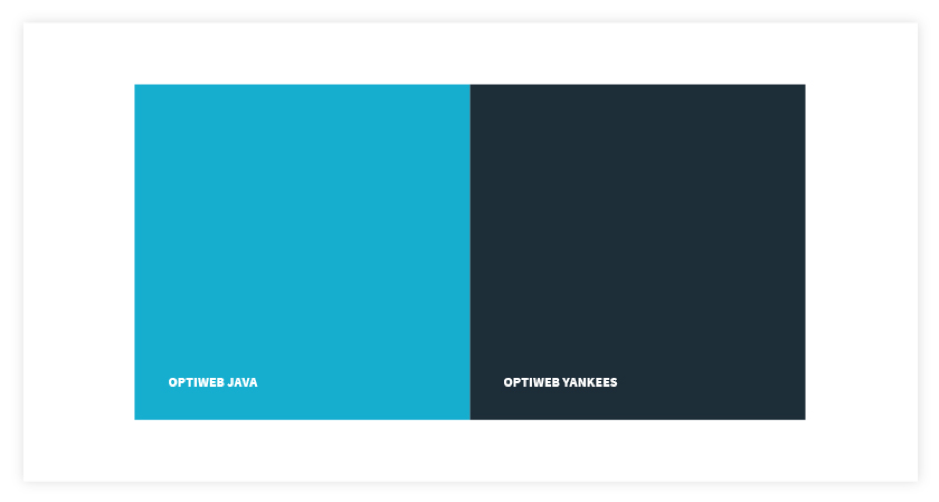
Last, but surely not least, come the colors. The primary blue stayed practically the same, while the primary dark blue was darkened and given a bit more color. We call them Optiweb Java and Optiweb Yankees.
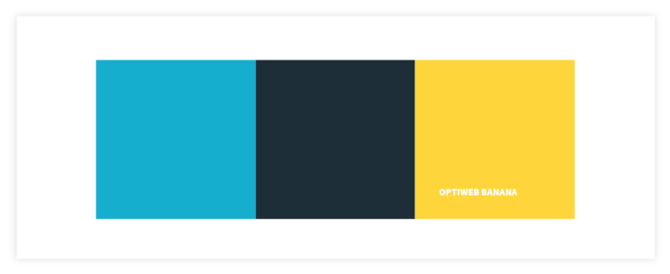
Since we haven’t used it in quite a while, you probably won’t remember that the old graphic image of the company also included the color orange as the secondary color. Since it was quite pastel and we wanted something a bit more energetic (and since Ana said that “orange is not a color”), we changed the orange into Optiweb Banana yellow.
A fresh look
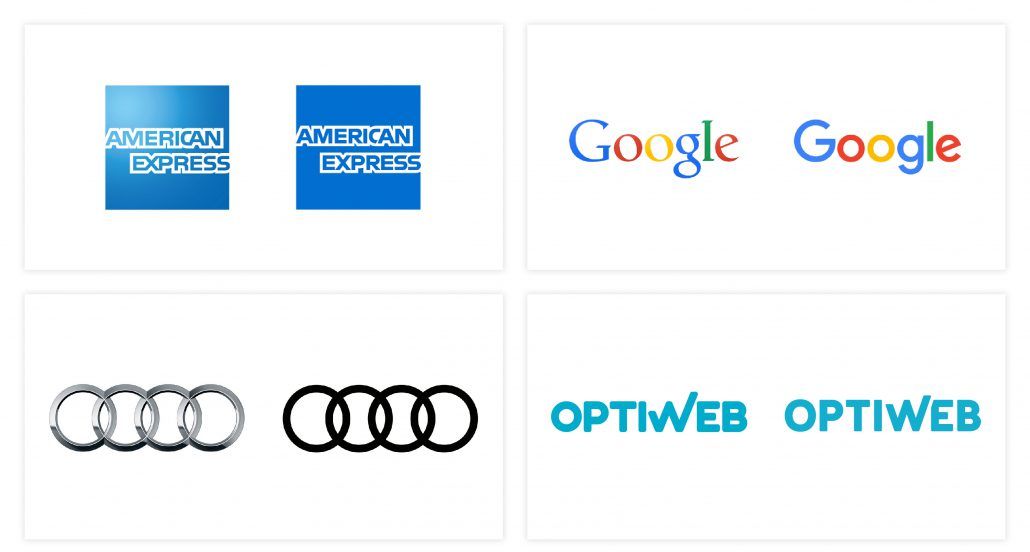
After taking a look at everything, we can conclude that we’re not talking so much about a redesign but about giving our logo a fresh look. And if we can rely on experience, it’s the small details that make up for a completely different feeling.
Sweating like a …
I used a lot of hours, quite a few nerves and I’m pretty sure my hair got greyer in the process. This wasn’t my first time designing a logo, but the fact is that designing a new image for a company is a huge responsibility. Even more so when you’re personally involved.
But, nevertheless, this trip also turned out to be educational and interesting. And, if I may say so, the result isn’t too shabby. :)

