Projects / Inotherm

Inotherm

Online Configurator Overhaul
Click Here to Visit the Configurator

In a bit more than three decades, the Slovenian entrance door specialist Inotherm went from a small family business to the biggest manufacturer of aluminium entrance doors in Europe. On a yearly basis, 350 employees produce more than 40.000 doors, of which 93% are sold outside Slovenia, especially on the highly competitive German market.

The complete manufacturing process takes place in the company’s high-tech production facilities in Ribnica, Slovenia. What is more, this is also the birthplace of numerous innovations that put Inotherm at the forefront of modern entrance door development.

Configurator development

  • Planning
  • Design (UX, UI)
  • Front-end development
0%
rise in the number of configurations
0%
longer time on page
0%
higher engagement rate

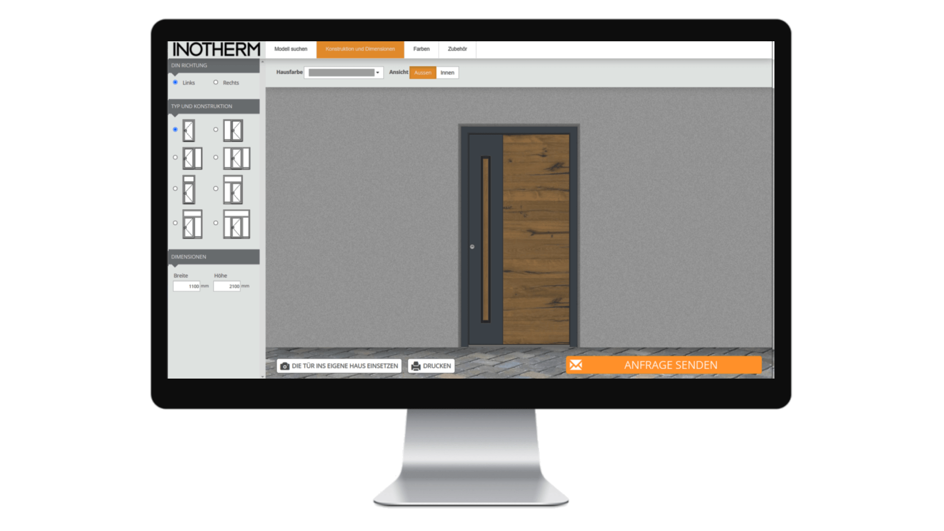
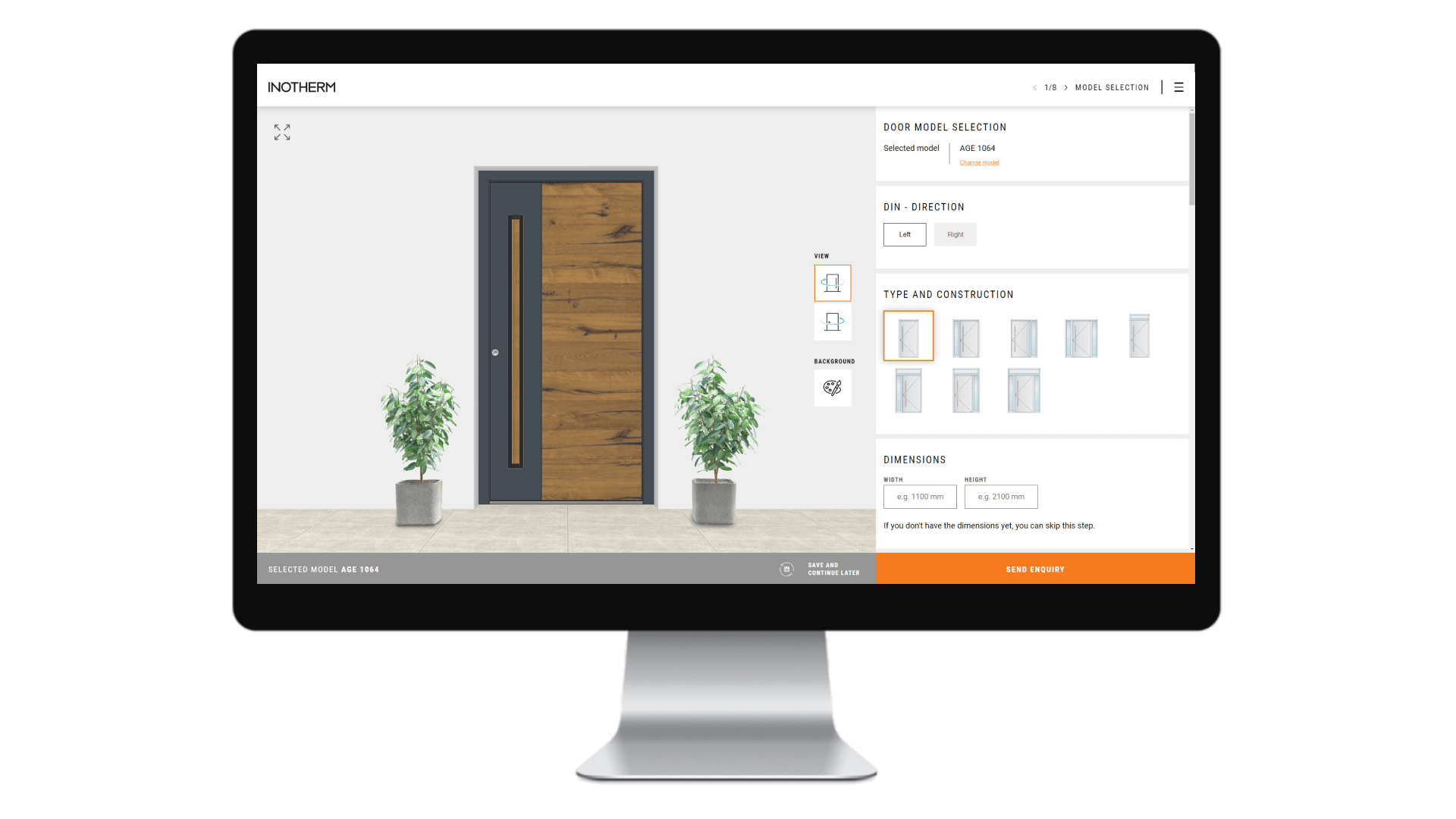
Before / after

Before the renovation on the left / After the renovation on the right

A First-class Entrance Door Needs a First-class Configurator

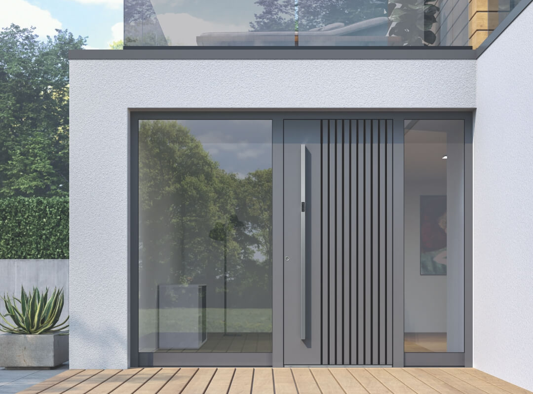
Inotherm’s customers can freely customise each of more than 400 entrance door models, choosing the preferred dimensions as well as personalising the door with special colours, glass elements and other accessories.

However, they don’t have to visit Inotherm’s showroom to do this as they can use Inotherm’s handy online configurator. To make its use as simple and intuitive as possible, Inotherm joined forces with our specialists and completely overhauled it.

When Looks are (Almost) Everything

Everything starts (and, sadly, often ends) with the user experience. A configurator must enable the user to personalise the product quickly and with total ease. And this is exactly where the old configurator failed as it wasn’t as intuitive as an average user would want it to be. It included too many steps and the elements were not logically laid out.

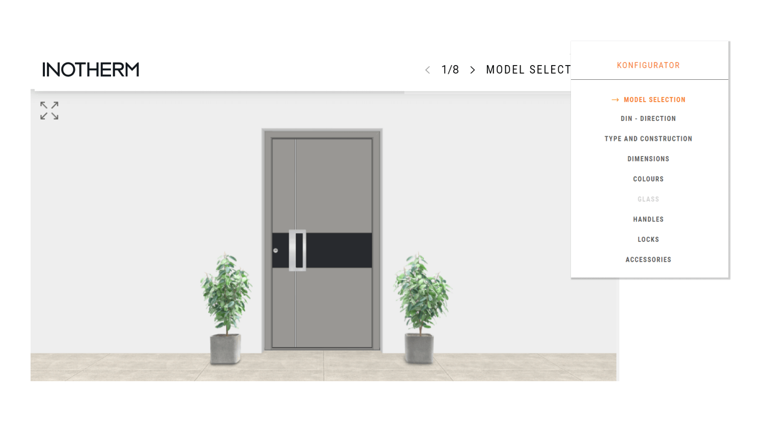
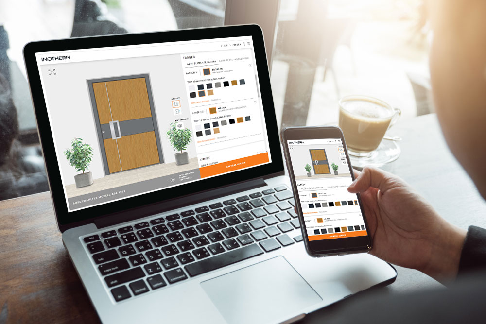
With the new configurator, users don’t have to move between individual steps anymore as all the personalisation options are listed on the same page and easily accessible in the scrollable sidebar. On the left side of the screen, there is an image of the door that the user is currently configuring, showing all the elements they have already chosen. The door can be personalised in any given order – a user might start with the colour or with the type of the fingerprint sensor, which makes the whole personalisation process easier and more flexible.

Design that Never Goes Out of Style

Trends in the field of user interface design are constantly changing. What looks stunning and modern today might seem outdated in a year. As Inotherm is known for the impeccable style of their doors, we wanted the configurator to also portray the stylish character of the brand. We therefore gave the user interface a thorough visual refresh, permeating it with timeless elegance that not only perfectly harmonises with the overall brand image but is also able to outlast the changing trends.

Our aim was also to create a design language that allows for easy integration of any new functionalities or adaptation to the brand images of more than 1000 partners that also use this configurator.

For All Customers = For All Screens

Despite the fact that smartphones and ecommerce have been happily married for a long time, many websites still struggle to offer mobile users the same experience as their desktop users enjoy. Sadly, this was also the case with Inotherm’s configurator, which is why we wanted its mobile version to be a lot more than just a copy of the desktop one.

In order to cater to those customers who want to personalise their new door on their smartphones, we adapted the mobile design to feature the image of the chosen door at the top of the screen, with the toolbar directly under it. This makes applying changes to the chosen door easy as one can simply scroll through the options and never lose sight of the current configuration.

More Practical for the Customer …

The best configurators are tailored to the needs of their users as well as the specifics of the products they help to sell. The Inotherm team knows that creating the perfect entrance door takes time. Choosing and comparing different design options and accessories requires some consideration while many customers also want to consult their architects or designers before the purchase.

To address this specific issue, the new configurator features the option of saving the configuration (in PDF format) or sharing it. This enables the users to save their current configuration and come back to it at any later point or show their personalised door to others in the form of a shareable PDF document.

… And the Seller!

Innovations are deeply ingrained in Inotherm’s DNA, which means the company launches new products or improvements on a regular basis. Therefore, we made sure that the new configurator also enables the client to simply expand their online portfolio, thus meeting one of the key criteria of any good ecommerce tool: scalability.

Data is Power!

Already in the planning phase, we put a lot of emphasis on the user behaviour, especially on defining the main drawbacks of the old version of the tool. In the new version, we successfully eliminated the weaknesses we’d identified, but at this point, the real analysis had just begun …

Alongside the overhaul, we also prepared and implemented a thorough measurement plan, which helps us to track the users’ interaction with the configurator in different phases of the configuration process. This doesn’t only help us identify key improvement areas but is also crucial for our advertising team, which can use the data to zero in on the right target group, especially those who haven’t yet managed to finish the configuration.

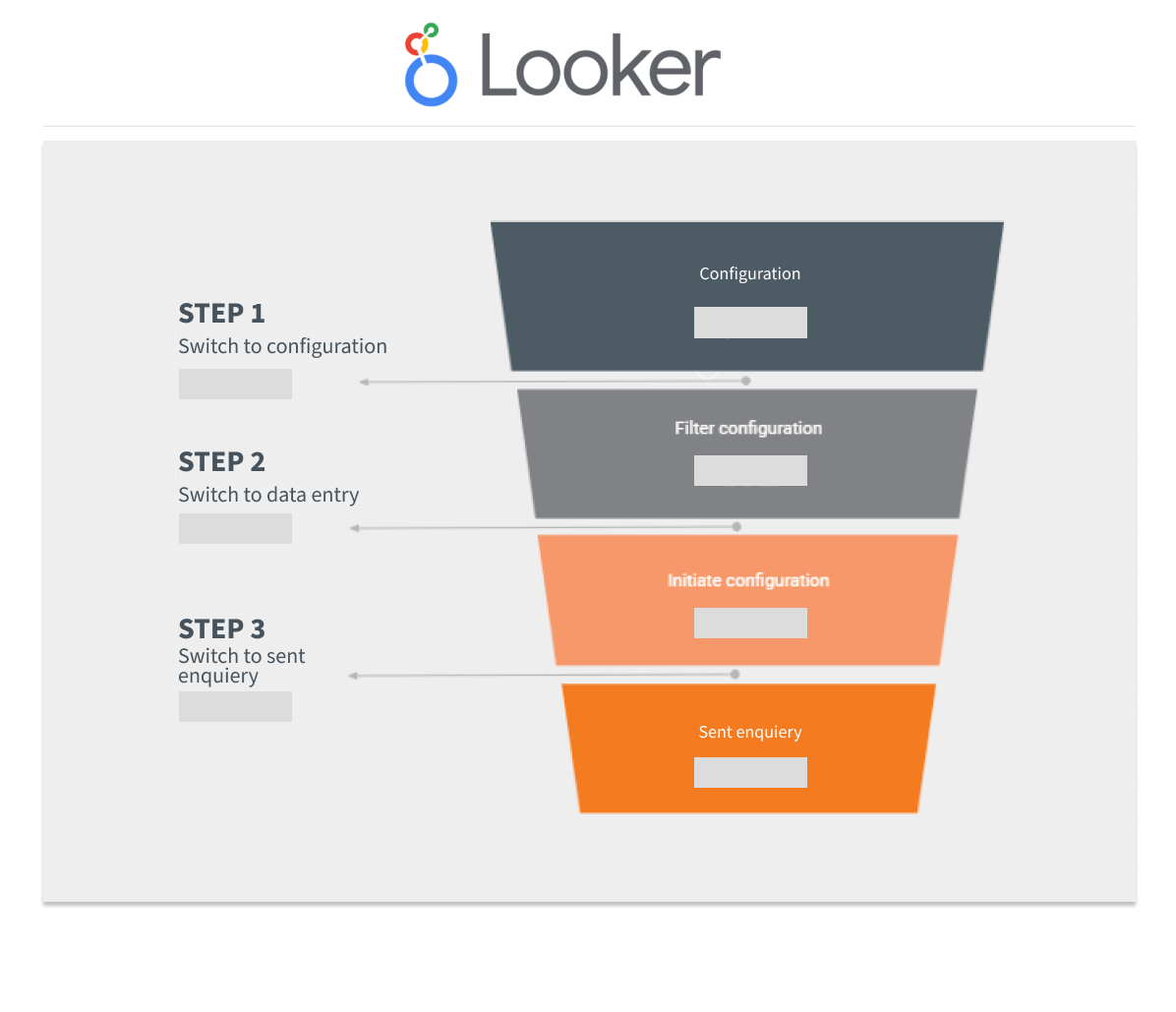
We also provided the client with a personalised report (Looker Studio), enabling them to track the configuration funnel and quickly respond to any major changes in the results – either positive or negative.

Numbers Speak Louder than Words …

SLOVENE VERSION
• 27.6% more configurations – only one month after launch
• Visitors spend 130% more time configuring their dream door (almost 2 minutes)
• More than 30% higher engagement rate

GERMAN VERSION
61,1 more configurations – only one month after launch
• Visitors spend 74,6% more time configuring their dream door (almost 2 minutes and 38 seconds)
• More than 30% higher engagement rate on all devices (+56,6% for the desktop versions)

0%
rise in the number of configurations
0%
longer time on page
0%
higher engagement rate

… But Words of Praise Mean a Lot

Optiweb has been our digital transformation partner for several years and I am incredibly happy that our project of strengthening Inotherm’s digital presence has reached another milestone. The new configurator hasn’t only improved our business results but is also a hit among our international partners, who are excited about the improved user experience. We were also very happy with the implementation of the new solution. The whole project was handled by an experienced team, who not only made sure that things ran smoothly but also paid a lot of attention to our specific business needs and wishes.

Bojan Lavrič

Marketing Manager

Let’s start a project