Projects / Intersport

Intersport

eCommerce website with sports equipment
www.intersport.hr
www.intersport.si
www.intersport.rs
www.intersport.ba
www.intersport.me

Intersport is the world’s largest chain of stores with sports equipment. In Slovenia, they are present in more than 30 outlets, offering a wide range of quality sports equipment of recognized brands. Besides Slovenia, Intersport is now present in over 40 countries and over 5,500 outlets.

eCommerce website:

  • Programming

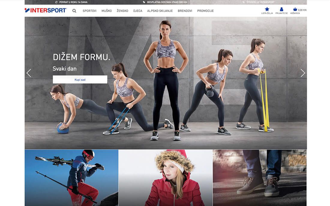
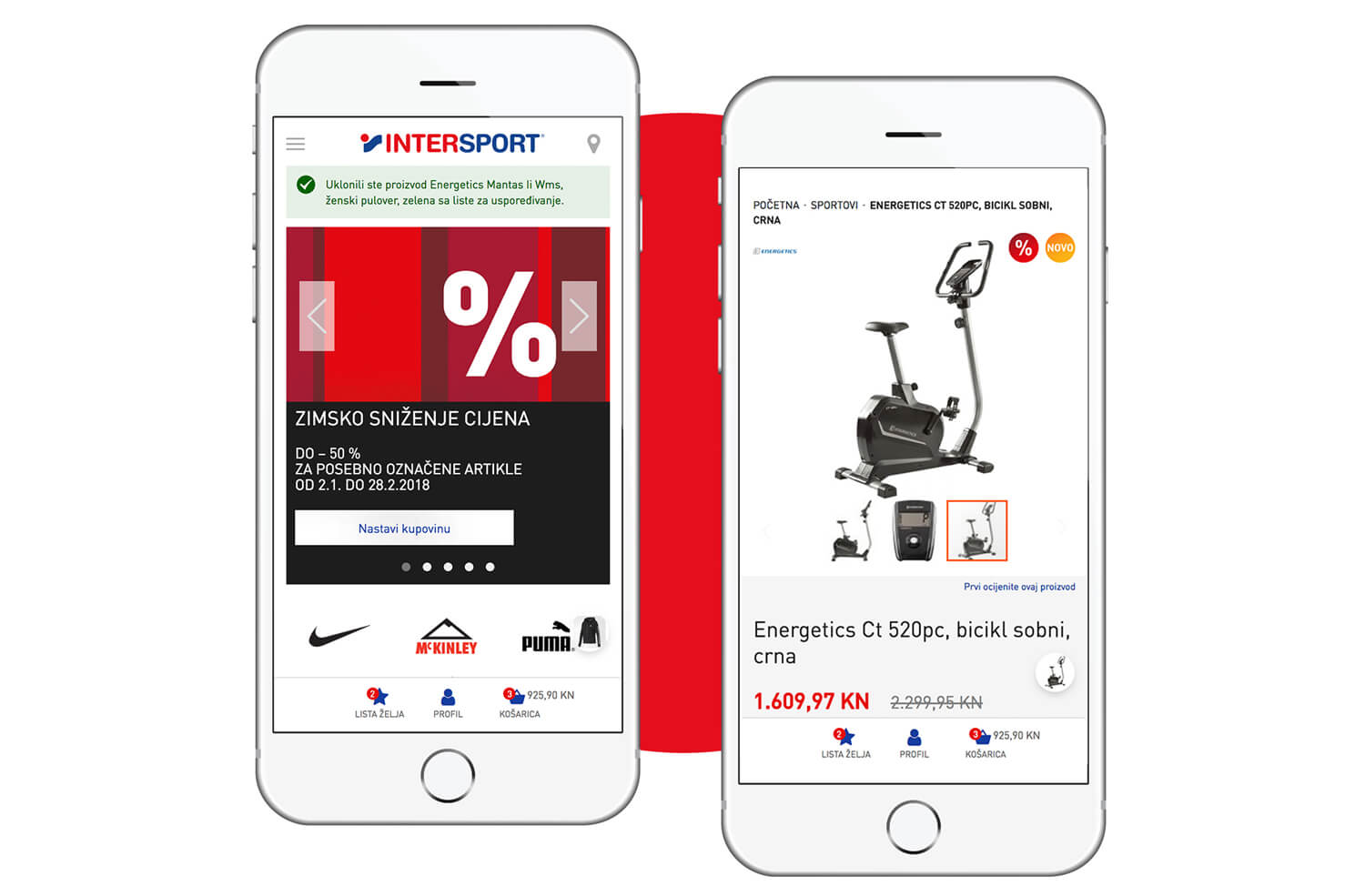
Before / After

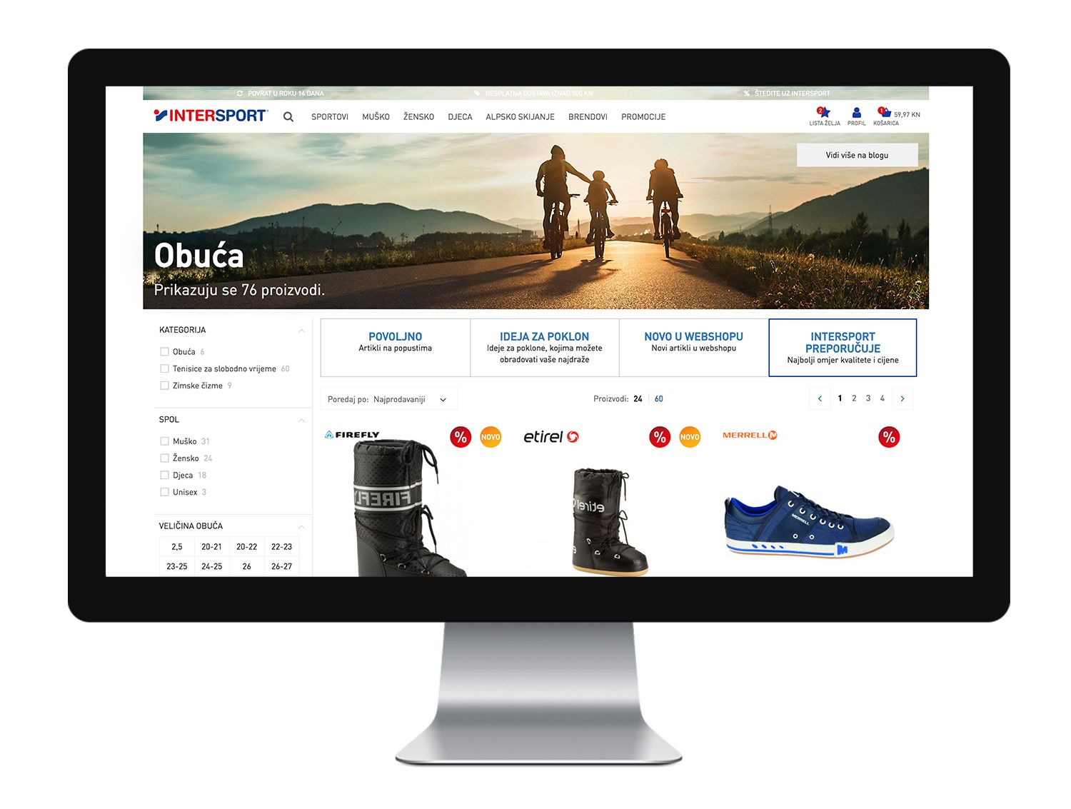
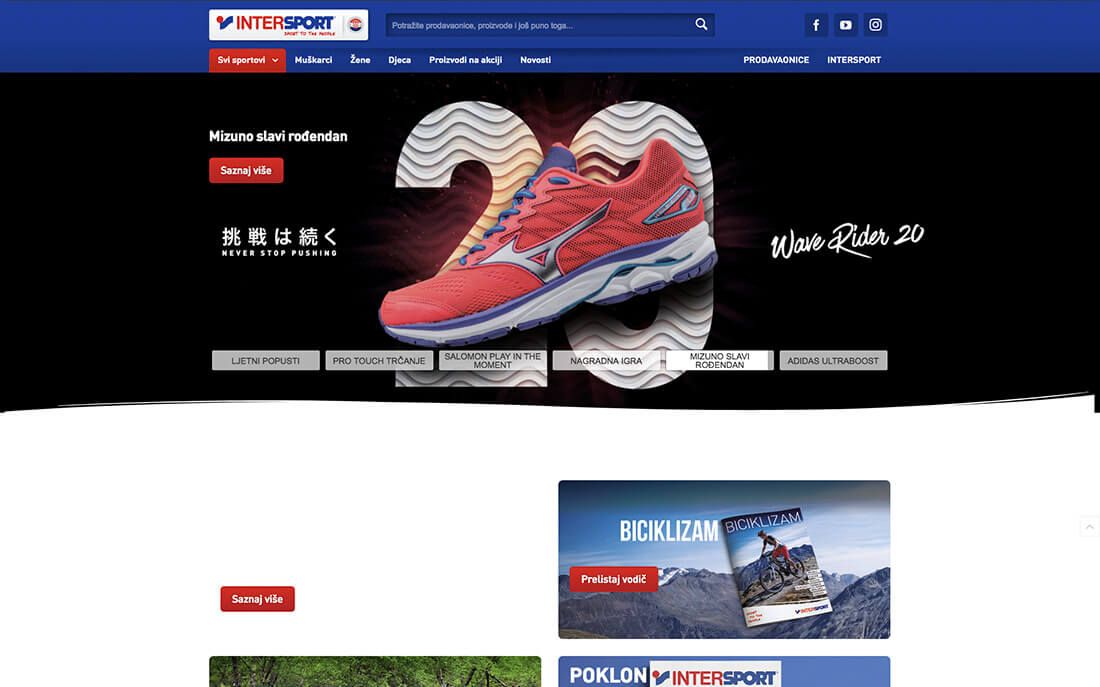
Before the renovation on the left / After the renovation on the right

Highlights

The client approached us with a clearly defined and well-thought-out structure of the eCommerce website, while the pre-prepared top-quality design was especially created for mobile users. They were only missing a reliable contractor who would know how to put all the desired functionalities into practice – and the amount of work was by no means small. Our goal was to successfully set up an online shop for the Croatian and Serbian markets – the priority was given to the two markets where Intersport was only present in the form of physical stores, so the customers were eagerly expecting the online shop. During our cooperation, the initial starting points were successfully complemented and upgraded on the basis of experience and additional analyses.

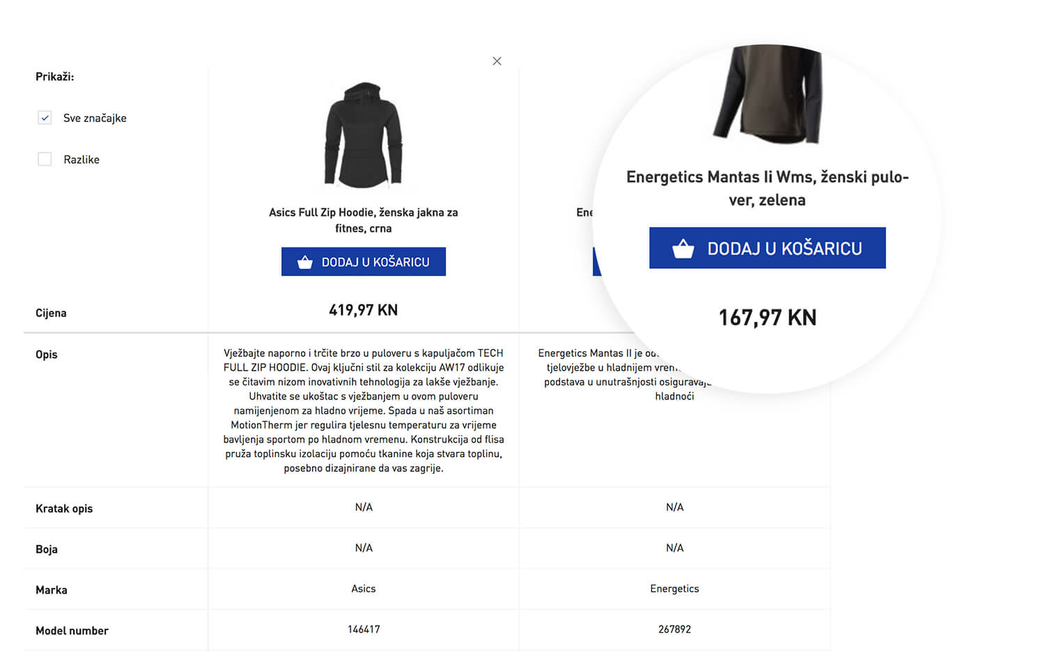
Quick purchase

Website users can compare up to 4 products. Individual products are shown with an image, price, description and main characteristics. The product comparator can show all the (common) characteristics or merely the differences. The added value of the comparator is the additional button “Add to basket”, where the user can choose the size (and amount) and add the product directly to the basket. The option of a quick purchase is of course possible on both desktop computers and mobile devices.

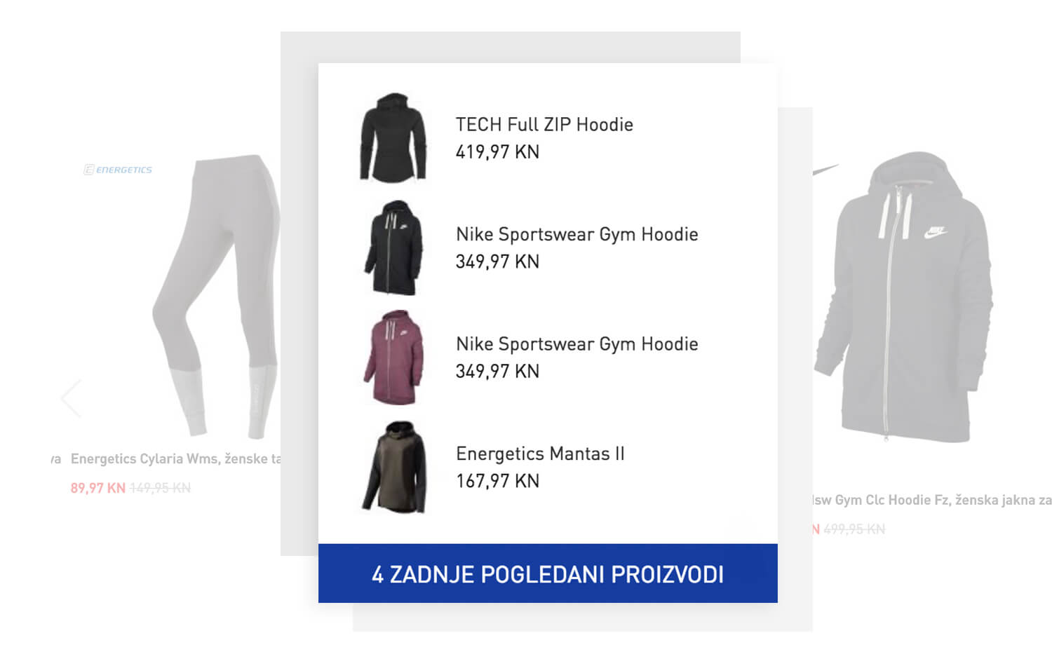
Last seen products

A more than welcome functionality of the new eCommerce site is the “Last seen products”, an icon in the lower right corner of the screen, friendly reminding the customers which products they saw last. By clicking on it, the icon extends and shows the last 4 products.

Elastic search

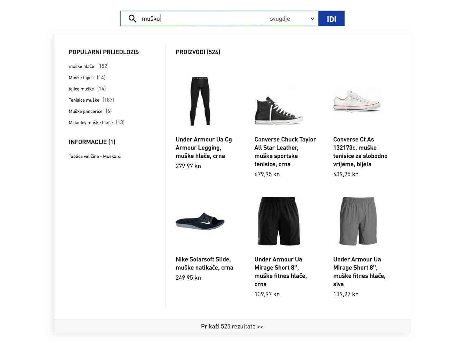
A classic search engine was not an option for the needs of our client. Therefore, we upgraded it, so the users can get all the information about a certain product as easily as possible. And our result? The search engine contains some of the suggestions that were searched by previous visitors, it detects typing mistakes and recommends similar search terms and it also memorizes your recent searches. The elastic search therefore “learns” by itself, making sure it is personalized for every user.
Besides the usual search, the search engine also offers some other search options – searching through popular suggestions and categories, while also offering a couple of additional information with every search.

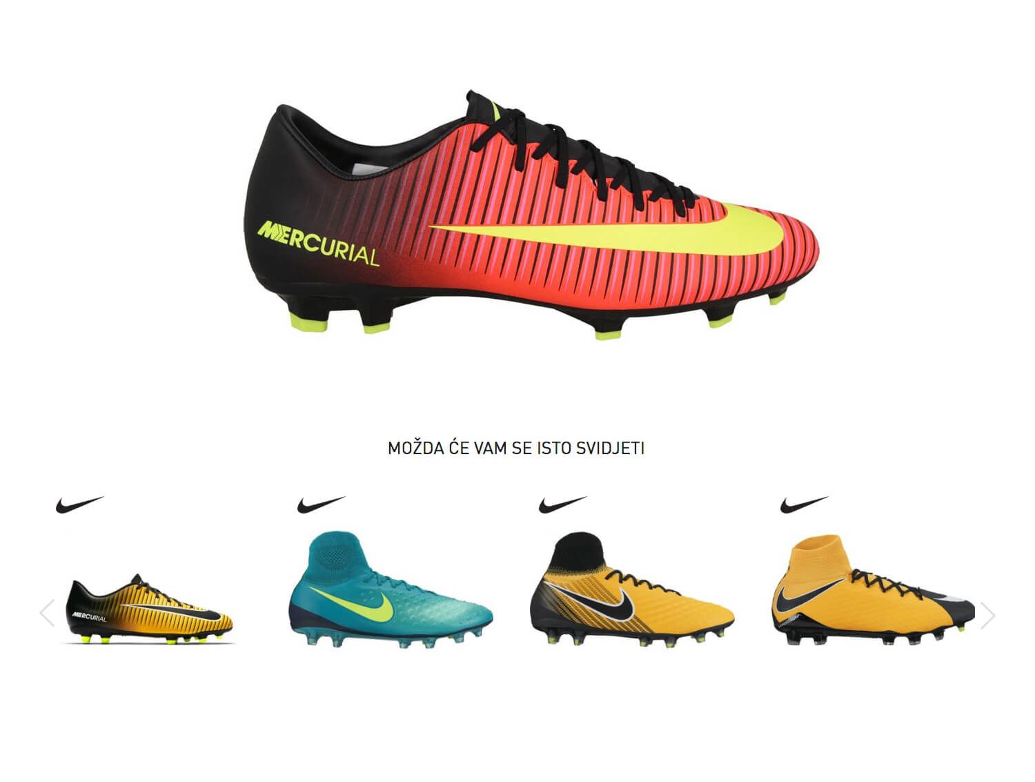
Upgraded related products

Related products are by no means left to coincidence. The online shop is connected with the software tool PIMPimcore, meaning that every product has precisely determined similar products based on a 6-figure code. This allowed us to use two different functions:
1. “Complete the look”: The selection shows 4 products that can complement the outfit according to the chosen item. E.g., if someone is searching for pants, the related products will show them T-shirts, if they’re looking for gloves, it will suggest hats, etc.
2. “Related products”: The selection shows similar products of the chosen item. If someone is looking for long Nike pants, the selection will offer long pants of different colors and brands or it will use the logic of the 6-figure code and offer long pants as well as short- and long-sleeved T-shirts.

User integration

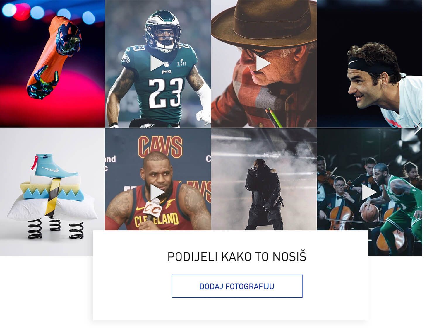
Because we want the users to keep coming back to the shop, we’ve made sure the website offers them quality content and references that help them decide on a purchase. With the help of the above-mentioned Pimcore, we’ve selected different Instagram profiles for every product page. Currently, the majority of accounts are chosen according to the brand, while in some cases there is also a division according to categories (gender and/or individual sports activities).
Every product can also be graded by the user – based on a few questions the system automatically determines the number of stars for each product, which helps the other users decide whether they want to buy something or not.
We’ve also added a strong tool for connecting users and creating content – a blog with its articles, which are divided according to different sports categories. Within each blog post we can directly place the display of products as well as similar and newest blog posts, while the users can comment on the posts or share them on social media.

An efficient basket

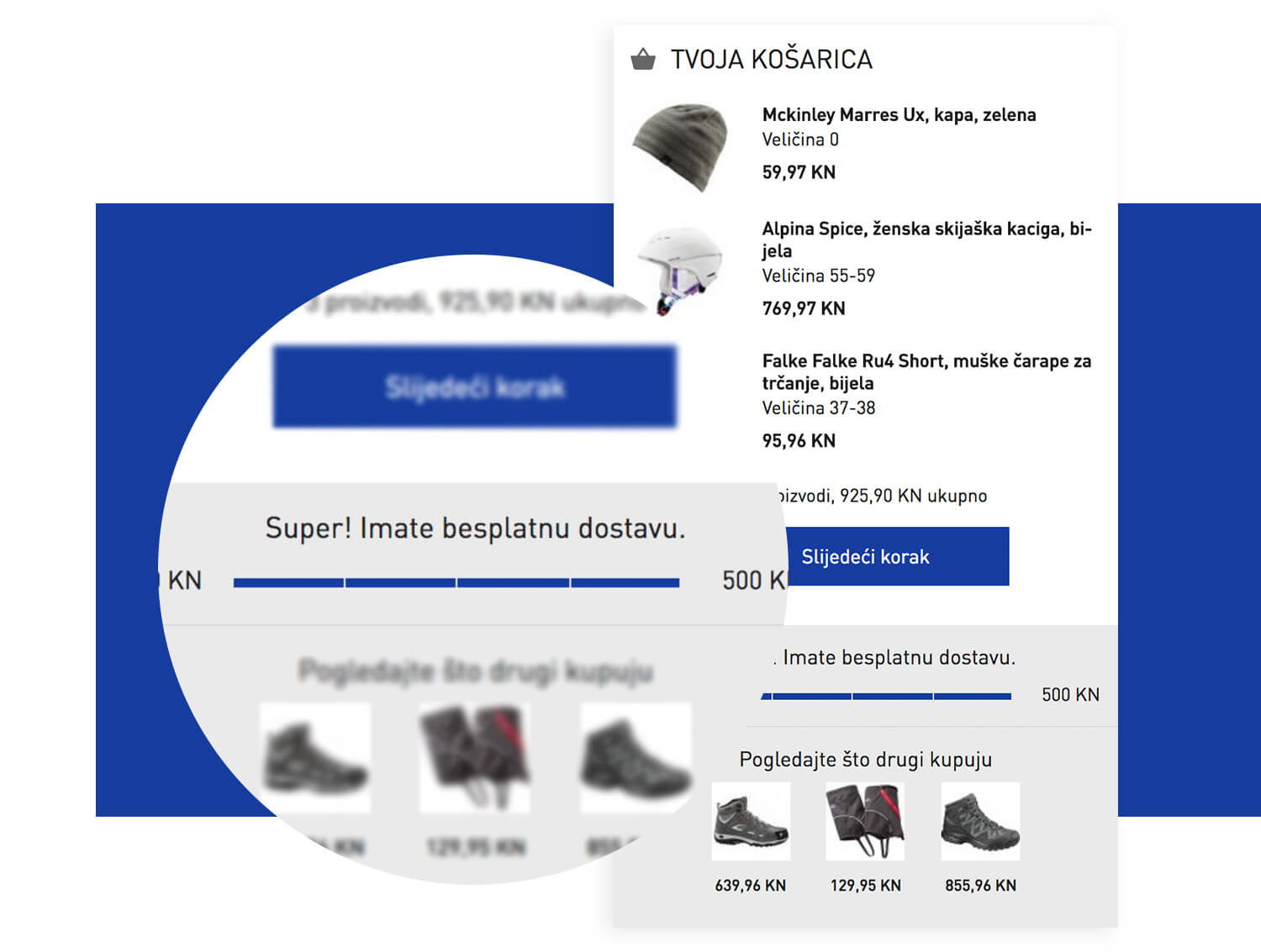
The purchasing process is simple and very user friendly and it also includes additional incentives to finish the purchase.
In the basket preview (as well as in the basket itself) the user is notified about the amount still missing until free shipping. The purchase process then starts by selecting the delivery method (shipping or picking up the product in a physical store). The next steps are choosing the payment and the shipping address. If the latter is the same as the billing address, it is automatically inserted and just needs the customer’s approval.

Stock and store locator

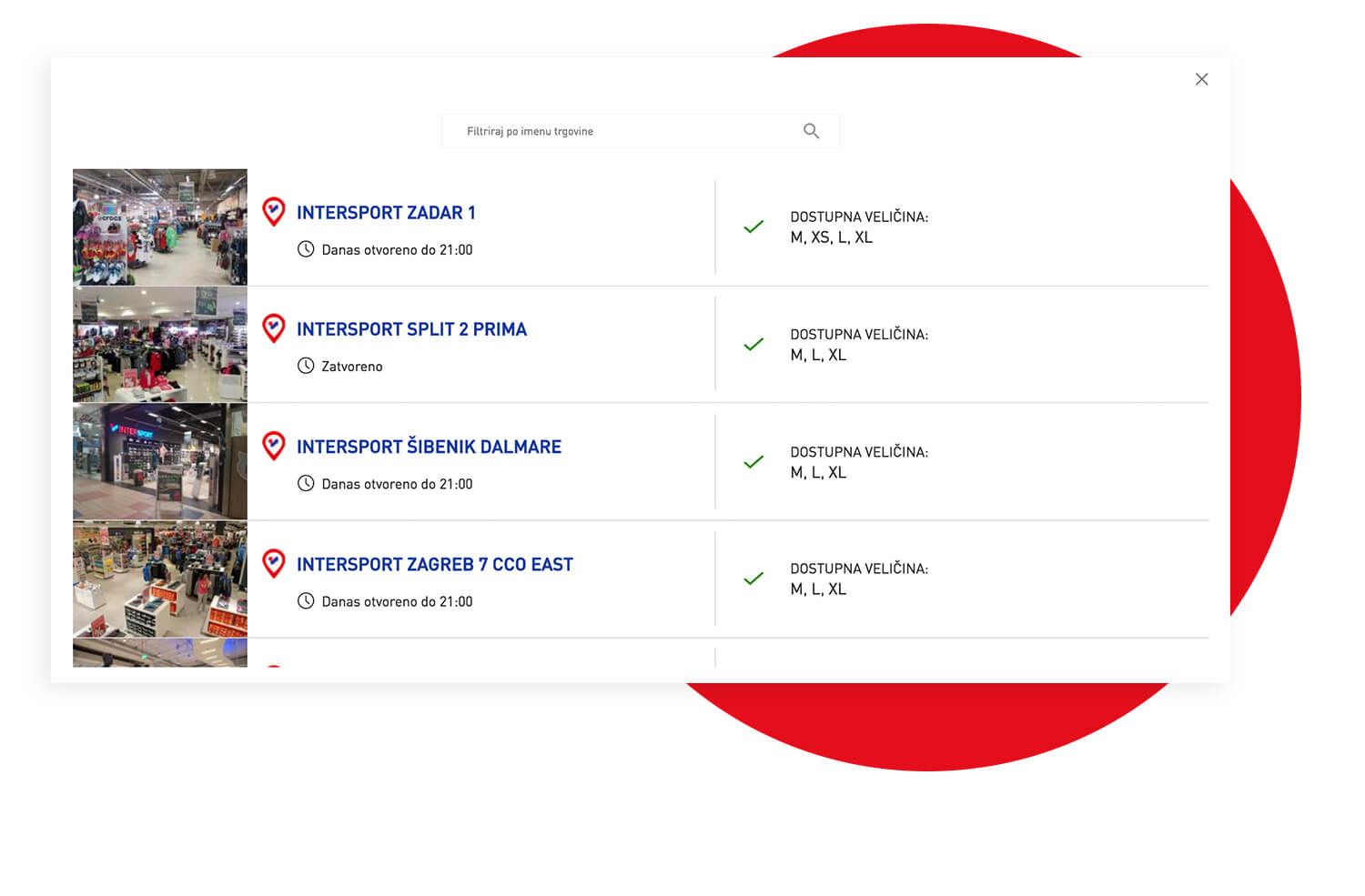
Since the number of products as well as inquiries is far from small, we’ve developed a simple yet effective system for showing the stock. Stock is recorded for each product individually: we can see which sizes and what amount is still available and we can also see in which physical stores a certain product is available. The data is updated several times per hour.
If a customer wishes to visit a physical store, the locator will search for the nearest one according to the selected place and the stock available.

Basket sharing

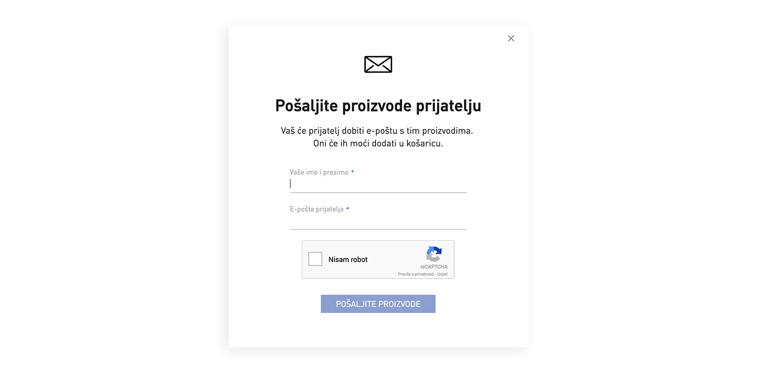
Users of the online shop can email the entire basket content to their friends. The recipient can then access the basket and, if they’re satisfied with the selection of the product, make a purchase with only one click, while they can of course also reject its content.

Results

For the mentioned two markets, the Croatian and the Serbian, we’ve developed the eCommerce site from the start. We therefore do not have any tangible numbers yet and can’t make any comparisons. However, according to the results we’ve acquired so far, we can claim that the site is user friendly and useful, visually appealing and functional.

Time for a new Magento eCommerce shop?

Is your online shop slow and unresponsive?
Is it clustered with products and confusing for your customers?
Then it’s high time you meet Magento!

Let’s start a project